 Formist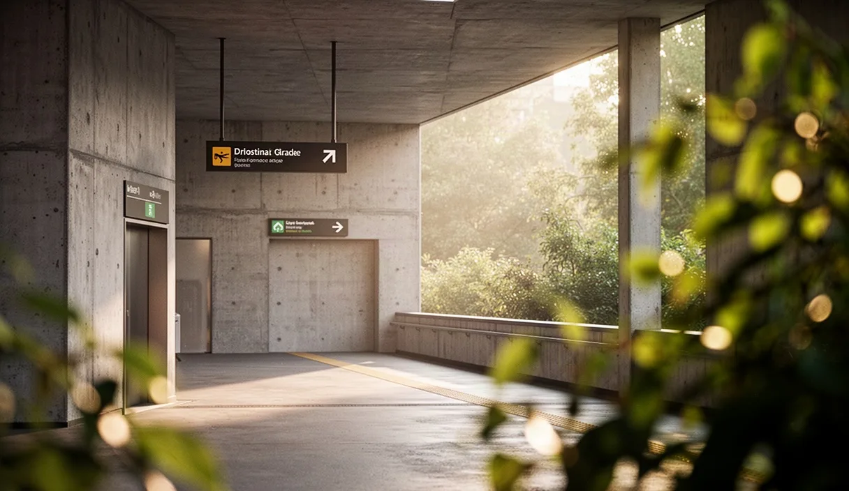

Public interiors present conflicting optical conditions. People move through transit hubs, hospitals, and libraries at different speeds. The eye seeks direction while processing competing architecture, lighting, and foot traffic. Type operates as spatial infrastructure. Its scale and clarity dictate whether an observer makes a timely navigation choice.
Typometry governs the physical sizing and spacing of letterforms in built space. It translates two-dimensional typography into three-dimensional navigation systems. This guide establishes calculation formulas, mounting coordinates, and verification methods for architectural signage. It relies on metric dimensions, human sightlines, and optical corrections.
Calculating type height from sightlines
Letter height correlates directly with viewing distance. An observer needs time to register, read, and comprehend words while walking. The baseline ratio for legibility sits between 1:200 and 1:250 for moving observers. At a ratio of 1:250, every 250 millimeters of viewing distance requires 1 millimeter of capital letter height. A viewer standing 5 meters away requires a capital height of 20 millimeters. A viewer at 15 meters requires a capital height of 60 millimeters.
Walking velocity alters this baseline calculation. An adult walks at an average speed of 1.3 meters per second. Reading a directional panel with three destinations requires 3 seconds. During those 3 seconds, the pedestrian covers 3.9 meters. The calculation accounts for the point where reading begins, not where the sign stands. If an observer must read a sign 12 meters before a hallway junction, the calculation distance becomes 15.9 meters.
Typeface proportions change legible distance. Capital height alone does not determine visual legibility. The x-height of the typeface plays an equal role in legibility. Typefaces with an x-height near 72 percent of the capital height perform reliably at distance. Open counters keep glyphs distinct under low light. Narrow apertures cause letters like 'c', 'e', and 'o' to blur together at distance.
| Viewing Distance | Cap Height (1:200 Ratio) | Cap Height (1:250 Ratio) | Typical Application |
|---|---|---|---|
| 2 meters | 10 mm | 8 mm | Door plaques, room identifiers |
| 6 meters | 30 mm | 24 mm | Corridor intersection directors |
| 12 meters | 60 mm | 48 mm | Primary circulation paths |
| 24 meters | 120 mm | 96 mm | Atrium overviews, terminal halls |
| 36 meters | 180 mm | 144 mm | Long concourses, arrivals zones |
Optical weight must balance physical distance. Letters appear thinner as viewing distance expands. Ultra-light stroke weights fade into background surfaces. Heavy bold weights lose their internal white space at distance. A medium or book weight preserves stroke structure across longsight sightlines.
Tracking adjustments for diagonal viewing
Letterforms rarely face observers at direct right angles. Pedestrians view corridor plaques and overhead panels from acute approach angles. This perspective distorts glyph shapes through horizontal foreshortening. The apparent width of each letter decreases as the approach angle sharpens.
A sign viewed at an angle of 45 degrees loses roughly 29 percent of its apparent width. At an angle of 30 degrees from the wall plane, perceived width drops by 48 percent. Letters compress horizontally while their vertical stroke heights remain unchanged. Interior counter spaces narrow rapidly. Characters such as 'e', 'a', 's', and 'g' fill in and become solid shapes.
Tracking compensates for this geometric compression. Standard digital fonts feature letter spacing designed for close reading on paper or screens. This default spacing proves too tight for public corridors. When setting type for long sightlines, open the tracking between glyphs. Add between 4 percent and 8 percent of the em space to the baseline tracking. The added space prevents adjacent strokes from touching under acute viewing angles.
- Perpendicular sightline (90 to 75 degrees): Standard text tracking, zero adjustment.
- Broad approach (74 to 45 degrees): Add 3 percent to 5 percent of the em space.
- Acute approach (44 to 20 degrees): Add 6 percent to 9 percent of the em space.
- Extreme corridor view (under 20 degrees): Use projecting blade signs instead of wall-flat type.
Word spacing requires equal attention. When tracking expands, word spaces must expand proportionally. A standard word space measures between 20 percent and 25 percent of the em square. For signage viewed diagonally, widen word spaces to 35 percent or 40 percent of the em square. This separation keeps distinct words from running together during movement.
Mounting heights relative to eye levels
Eye level is not a single uniform metric. Standing adult eye height ranges from 1420 millimeters for shorter individuals to 1730 millimeters for taller individuals. A median standing eye height sits near 1570 millimeters. Seated eye height for wheelchair users falls between 1090 millimeters and 1250 millimeters. Children view space from lower baselines. Signage systems must serve this entire visual band.
Overhead directional signs require clearance for physical safety and visibility over crowds. The bottom edge of suspended signs must hang no lower than 2150 millimeters above the finished floor. In transit facilities with maintenance vehicles, this clearance often rises to 2400 millimeters. Signs hung above 2150 millimeters force the neck upward. An upward gaze angle beyond 15 degrees causes physical strain during sustained reading. Set overhead sign heights to balance physical clearance against human gaze comfort.
| Sign Type | Mounting Reference | Distance from Finished Floor |
|---|---|---|
| Suspended overhead | Bottom of sign panel | 2150 mm to 2300 mm |
| Wall directional panel | Centerline of visual field | 1400 mm to 1520 mm |
| Door identity sign | Latch side, character baseline | 1220 mm to 1520 mm |
| Information desk directory | Centerline of text area | 1250 mm to 1400 mm |
Wall panels serve intermediate reading distances. The visual centerline of a wall-mounted directional plaque should sit between 1400 millimeters and 1520 millimeters from the floor. This band remains accessible for standing pedestrians and wheelchair users. Keep lines of text within this zone whenever possible.
Tactile and Braille elements demand strict vertical placement. Tactile characters must comply with regional accessibility laws. In the United States, ADA standards place the baseline of tactile characters between 1220 millimeters and 1520 millimeters above the finished floor. Local codes vary globally. Consult a certified accessibility specialist or local building official to verify exact regional legal thresholds.
Managing contrast against variable walls
Visual contrast dictates letter legibility before stroke geometry registers. Contrast depends on the Light Reflectance Value, or LRV, of adjacent surfaces. LRV measures the percentage of light a surface reflects on a scale from 0 to 98 points. Absolute black reflects near zero points. Clean white reflects near 98 points. Architectural materials sit across this scale.
Legibility requires a substantial LRV spread between the letterform and its immediate background. A difference of 30 LRV points provides bare minimum distinction for clear vision. Public navigation requires higher reliability. Aim for an LRV differential of at least 60 points between type and sign panel. If a wall features an LRV of 22, the sign face or letters should measure above 82 LRV or below 5 LRV.
Raw architectural materials create unpredictable backgrounds. Poured concrete, textured brick, and wood paneling possess micro-textures. These textures cast tiny shadows when lit by raking light. Shadows destroy the perimeter definition of applied vinyl or dimensional cut letters. Mount lettering on an opaque backplate rather than directly on rough substrates. A dedicated backplate stabilizes the contrast ratio across different times of day.
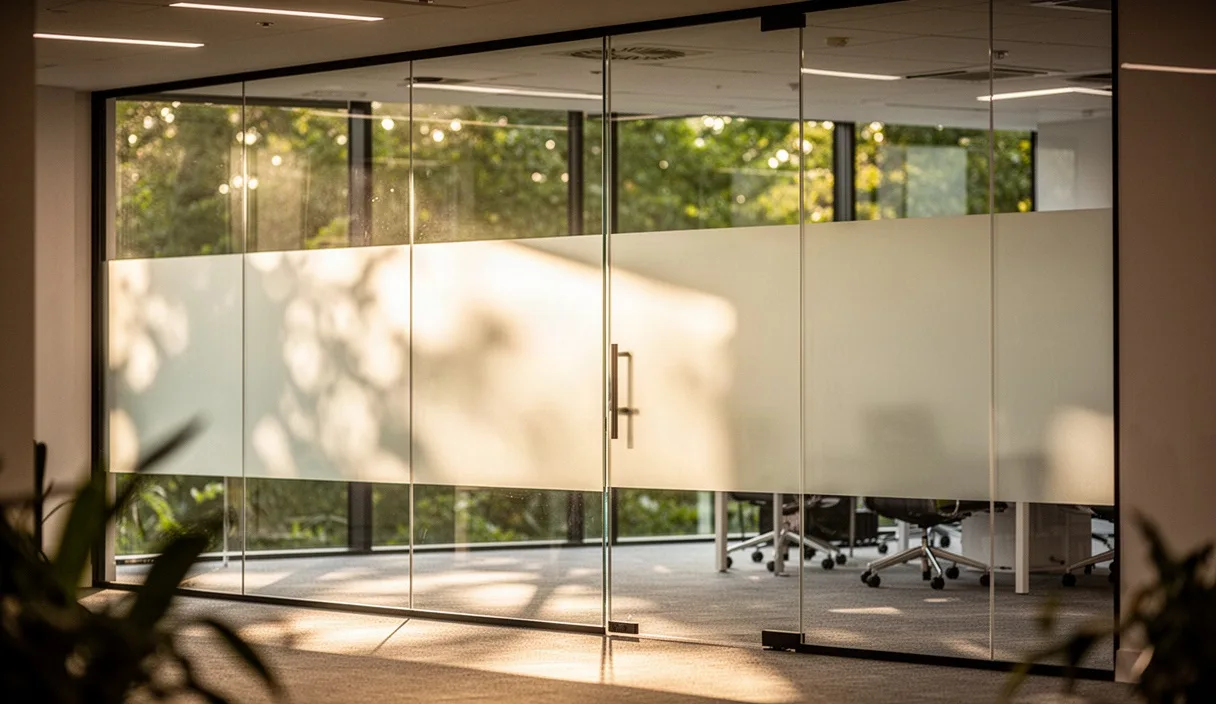
Glass walls present severe contrast hazards. Light conditions behind interior glass partitions fluctuate as rooms fill, empty, or change lighting states. Direct vinyl applied to bare glass turns illegible when rear illumination equals front illumination. Apply an opaque, frosted, or solid backer strip behind all typography on glass partitions. The solid band shields the letterforms from distracting background movement.
Field testing readability before production
Digital proofs on backlit monitors deceive the eye. Screens emit light, while interior signs reflect ambient light. Software canvas views eliminate spatial scale, walking cadence, and peripheral clutter. Physical mockups in the actual interior space are mandatory before production begins.
Construct full-scale mockups using rigid foam boards or dense cardstock. Print the exact vector artwork at a 1:1 scale. Mount these mockups at the specified coordinates using non-damaging temporary tape or adjustable stands. Ensure the mounting heights match the final construction documents down to the millimeter.
Execute pedestrian approach trials. Start at the farthest corner of the intended sightline. Walk toward the mockup at a steady pace of 1.3 meters per second. Note the exact distance where individual letters resolve into words. Measure the distance where the sign first becomes visible versus where it becomes readable. If the sign becomes readable only after the viewer passes the decision point, enlarge the type height by 15 percent.
Test the installation under varied lighting periods. Inspect the mockups at morning, mid-afternoon, and evening hours. Check for specular reflections from ceiling downlights. If downlights create glare spots across the text, specify matte or satin laminate finishes. Observe how shadows from raised or dimensional lettering fall across the panel. Deep dimensional letters cast shadows that distort their own character shapes under steep ceiling lights.
Common mistakes
- Selecting condensed typefaces to fit long room names onto small panels. Condensed glyphs collapse into vertical bars at distance.
- Using high-gloss paints or reflective acrylics. Ambient lighting causes specular glare that washes out letter edges.
- Failing to account for viewing angles in corridors. Setting default digital tracking without horizontal compensation.
- Mounting overhead signs too low to achieve readability. Observers hit low signs with carried objects or tall carts.
- Setting raised letters directly on variable wall materials without backplates. Surface texture breaks stroke continuity.
- Assuming all users possess identical standing sightlines. Neglecting seated eye levels on directional panels.
Practical next steps
Identify every decision point across the architectural floor plan. Decision points occur at corridor intersections, elevator lobbies, and building entrances. Mark the primary sightlines for each point on the drawing set.
Measure the physical distance from each approach point to the proposed sign location. Use the 1:250 ratio to establish the minimum capital height for each sign type. Record these values in your signage schedule spreadsheet.
Select a signage typeface with an open counter structure, distinct glyph shapes, and an x-height near 70 percent of capital height. Test the typeface with sample names rather than generic Latin placeholder text.
Engage a certified accessibility consultant to verify local regulatory compliance for mounting heights, visual contrast ratios, and tactile requirements. Local building codes take precedence over general typography formulas.
Fabricate full-size paper mockups of critical signage types. Mount them on site during active construction or occupancy. Verify viewing angles, ambient lighting reflections, and read times before issuing final fabrication drawings.